There’s Pie in the Lunchroom
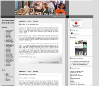
 This site is quite nice, using the four colored boxes motif to make their sidebars and articles distinct. Especially nice is the gradient shading at the bottom-left hand corner to separate the text blocks from each other and to draw attention to the details for each block.
I kind of like the little stipple-pattern used as a separator too. (Pie Home Page)