WebSideStory

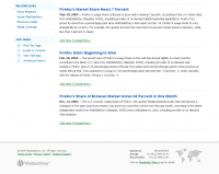
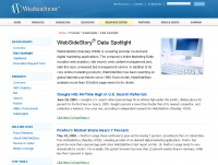
 A very corporate web site, but light-colored as well. Good use of line spacing (1.30em), light menu headers on top (tightly against one another and turning light gold when hovered). Uses green for the “read more” links to draw the eye and differentiate from menu links. The bottom of the page has an elegant copyright and site info section, with nicely grayed images. (WebSideStory Home Page)