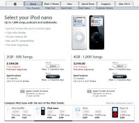
Apple Nano
Published by marco on

 And then there’s Apple. They have an enviable style to their pages. The large black block draws in the eye to the product. The product description uses a nice open line-spacing and magazine-style picture layout to make a pleasing picture. “Buy now” is nice and obvious against the white background (and doesn’t even introduce an extra color, matching instead the banner). The store page highlights the two colors available (matching the selection buttons to the products) and using small pictures and visual cues to back up descriptions. Appropriate padding, margins and alignments are in use everywhere … the look of the content is just as important as the message. (Apple Nano Home Page)