Firefox 2
Published by marco on
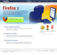
 Firefox 2 Home PageAfter years of changing styles and hit-or-miss site designs, Firefox seems to have finally hit a nice, open, clean style. The download button is huge and green and inviting. The background graphic is confined to the product area (not in the header or footer, reserved for “corporate” use) and adds to the fun feel. Overall, it’s airy, making good use of white space and all text is well-aligned (bullet titles aligned with descriptions … yay!). Even the footer got alignment attention, offering an unobtrusive language chooser, which includes an impressive array of languages. On top is the company toolbar, making use of more corporate navy/graphite tones and extremely subtle gradient shading; you can’t see it here, but the hover effect is subdued and sophisticated as well. Even the awards are nicely aligned on the right and don’t stick out like big, cheesy sore thumb (though the font below them is unreadable). And, most importantly, the redesign affects more than a single page this time! It extends to all support, add-ons and product pages and even the new “about” section.
Now if they could only ditch the shout-out on their main page.