Designing an online resumé
 It had been three years since I’d updated my resumé. To be clear, I’m not looking for a job[1]. I’m very happy at the company I (partly) own, Encodo Systems AG.
I see my resumé more as a description of my career than as a document with which I can get hired. As a partner in a company, it’s good to have an up-to-date profile handy, e.g. for including in RFPs.
One step was to write down the history of my more-recent projects and skills. In addition, though, I wanted to update the look and functionality a bit.
The latest version is here. You can see a full-screen rendering to the right.
Requirements
- Information Overload: I’ve been programming for 35 years and doing so professionally for 25. A standard structure doesn’t really cut it for packing in that much information. I don’t want to leave anything out, but I want there to be summaries of some of the more text-heavy sections. So, I summarize projects and skills with charts instead of lists.
- Accessibility: I wanted to improve the accessibility of the by-now three-year–old version. The HTML wasn’t as semantic as it could have been, particularly in the charts. I wanted the document to be legible, even when viewed without any styling at all.
- Rendering: I also wanted to improve the accuracy of the charts. The bars on the charts in the existing version didn’t line up very well, particularly at some zoom levels or page widths.
- Mobile Support: The existing version wasn’t very mobile-friendly. It was somewhat responsive, but wasn’t clean enough at low resolutions.
- Printing/PDF: I wanted a user to be able to print from the browser with reasonable reliability. I provide a pre-rendered PDF, but anyone can just print the HTML page with a modern browser to get a PDF or printed version.
- Lead by Example: I wanted my resumé to serve as an example of my work, to provide evidence of my skills as a full-stack developer (at least as far as usage of CSS and HTML goes).
Design
I’d already tackled the challenge of displaying a career as long as mine in an apprehensible way in the existing version of my resumé by summarizing my projects and skills in charts, with the years on x-axis and individual items on the y-axis.
For projects, I used color-coding to indicate the roles. For skills, I used color-coding to indicate the level of proficiency.
This concept served well to offer a good overview. I left this concept largely unchanged, but made the following improvements:
- Included a legend on each chart instead of only once, at the top
- Included the years for each row (for projects)
- Moved the labels next to the bars rather than partially overlapping
- Tighten up the presentation and calculation of areas
Implementation
These are among the techniques I used to build a page that satisfies all of the requirements above:
- Flexbox: This CSS display type is really quite optimal for a responsive text-flow. The result is tiles of data that flow into as many columns as fit nicely into the viewport width. In addition to the main layout, now the charts also use flexbox, a much better layout than the margin-based spacing approach I’d used in the previous version.
- Semantic HTML: I use lists and list items wherever it makes sense, then style them to fit the overall theme. A screen-reader, however, just sees lists. I applied the same concept for the charts, rebuilding them with tables instead of generic containers. Again, a screen-reader can deal with a standard table instead of trying to make sense of non-semantic containers. In the charts, I included the proficiency data in a separate column, but hid it in the styled view.
- Colors: I’d chosen the previous chart colors manually. That version had the restriction that dark text had to be legible on the bars, artificially restricting the breadth of the palette. In the current version, labels are next to the bars, so I’m no longer restricted and was able to use an online data-color picker to choose colors that are accessible for more seeing levels (and also when printed with grayscale).
- CSS
calc(): Instead of calculating and storing high-precision percentages for column widths, I now use the CSScalc()feature to let the browser calculate all dimensions at a level of precision that matches its own rendering engine. @mediaqueries: For responsiveness, I rely on bothflexbox(as noted above) and@mediaqueries to define a few “breakpoints” in the layout. At lower resolutions and widths,- Year labels for data bars are removed
- Major headers are no longer in a separate column
- Legends are moved above their respective charts
- A smaller font is used in charts
- Printing commands: Since the layout flows so naturally, I only had to use
page-break-before: alwaysa few times—mostly before the charts—in order to ensure clean printing on an A4-sized page. attr()content: In order to avoid cluttering an unstyled page with elements relevant only to the charts, I use theattr()CSS function to inject content like legend captions or year headers. These values appear in styled content, but are hidden in unstyled content.
Examples
Project History: Wide
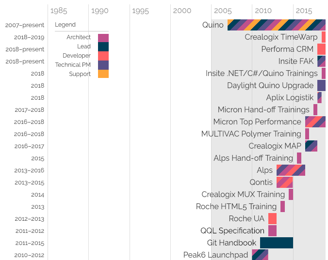
This is part of my Encodo history, rendered for wide screens. It includes a legend as well as a year-span for each row, to the left of the chart. This chart gives a nice overview of where Encodo fits into my overall time as a programmer as well as the diversity of projects and roles I’ve had on often-simultaneous projects. Each of these projects is listed individually below the chart, but it offers a much more intuitive view of how those projects fit together.
Project History: Medium
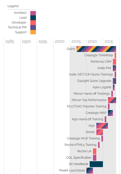
The next size is “medium”, for larger, more-modern phones. At this level, the year headings are removed and the legend moves above the chart, to avoid overwriting content. Also, the chart font is reduced to shorten captions. At this width and for this chart, that’s less likely until the screen gets even smaller, but for other charts, information is more centered and overlap happens more quickly.
Project History: Tiny
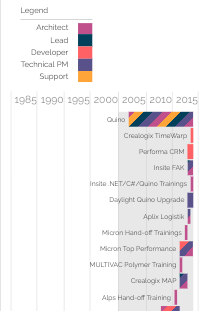
Finally, there is the tiny version, optimized for screens like the iPhone4. The only change here is that the captions are rendered in an even-smaller font, to avoid leading captions from pushing bars to the right.
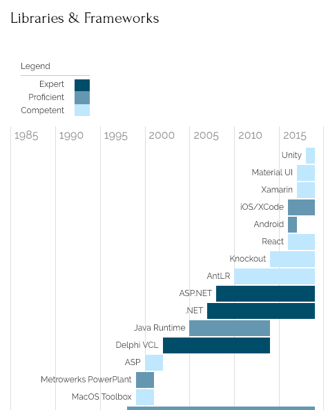
Skills History: Wide
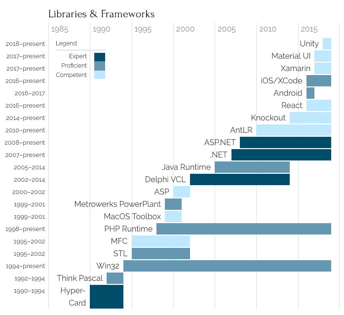
For the skills charts—some of which start quite early in my life—I’ve used soft hyphens () in some longer captions, to ensure proper wrapping (e.g. for HyperCard). This is the wide version:
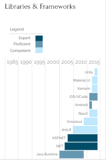
Skills History: Medium
As with project histories, the skills charts move the legend above the chart, when displayed below a certain width.
Skills History: Tiny
As with the projects chart, the skills chart renders remarkably well on tiny screens.
Unstyled Charts
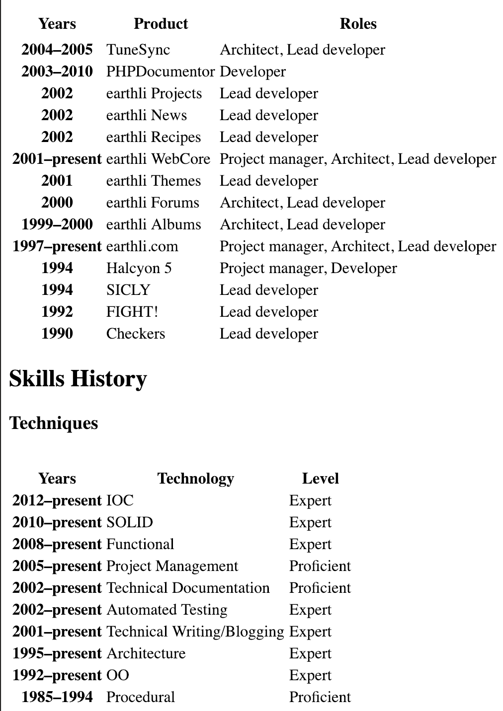
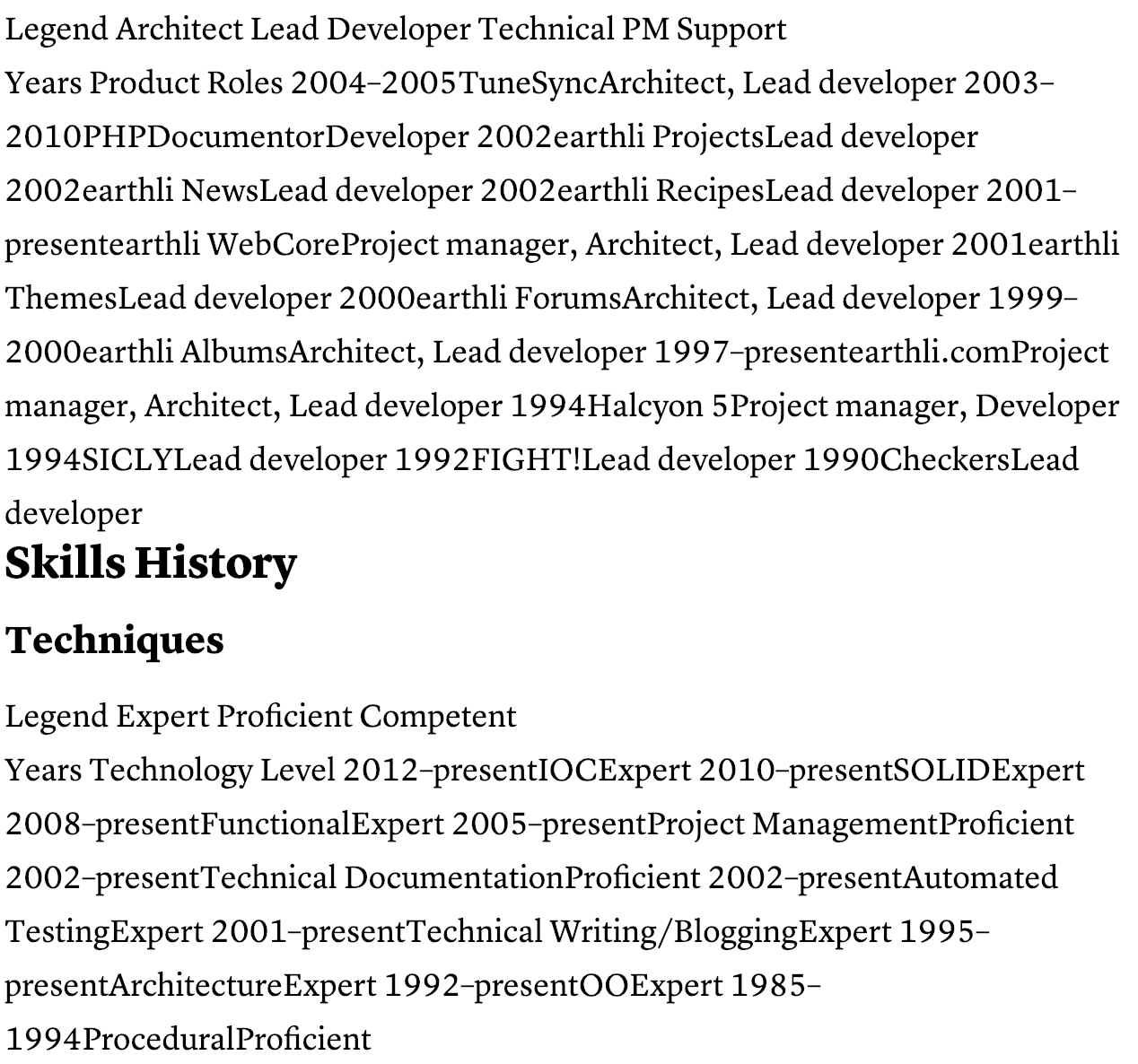
Finally, the following graphic shows examples of the projects and skills charts without any styling at all. As you can see, these charts are just standard HTML tables and are quite legible for screen readers, complete with proper headers and cells.
I also tested this document with Safari’s and Instapaper’s reader modes. These work, for the most part, but both of these renderings make a bit of a hash of the tables/charts, each in their own way.
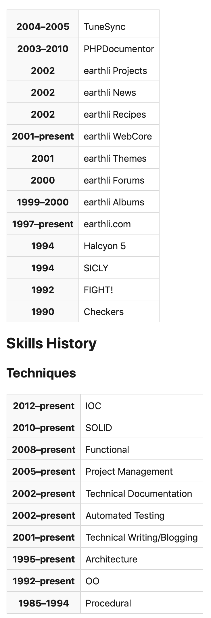
Safari Reader
The Safari Reader does an admirable job with the headings and lists that comprise most of the document. However, it doesn’t render the third column—”Roles” and “Level”, respectively—because it heeds the CSS that hides those columns. I haven’t yet come up with a solution for user agents that only use a part of the CSS.
Instapaper Charts
Instapaper also does a good job with the majority of the document, but also stumbles a bit when rendering the tables for the charts. In this case, Instapaper properly ignores all of my CSS—including the command to hide the third column with “Roles” or “Level”—but doesn’t really do the table structure justice, formatting it as a single, long line of text.
Conclusion
Overall, I’m pretty happy with how the final version turned out. I’m sure there’s room for improvement design-wise, but I think the charts are pretty good. In particular, I think I’ve managed to “Lead by Example” in designing and building a more-complex web page for all types of user agents and users.
